When you choose to publish a SharePoint Workflow from SharePoint Designer you have the option to generate a visualization of the workflow. This setting is found on the Workflow Settings page in SharePoint Designer when editing a workflow.
If you check this option, SharePoint Designer creates a Visio diagram that is used to display the status of an individual executing workflow in a visual manner. More details on this feature can be found here in this two part article from the Visio product team:
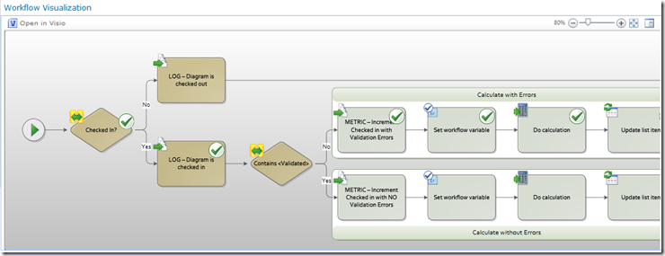
The problem I found with this feature is that the diagrams that are generated are not very flashy. They have no background graphics and no themes are applied to the shapes. Sometime the layout is also not optimal for what I would like to see or expect to see.
My concerns can all be addressed by editing the diagram that SharePoint Designer generates in Visio.
To do this:
- Open SharePoint Designer
- Navigate to the site that contains your workflow and open that site
- On the main page choose the All Files category from the left navigation pane
- In the All Files view, open the Workflows folder
In the workflows folder you should see a folder for each of the workflows that you have published - Open the appropriate workflow folder and you should see the [workflow name].vdw file
- Right-click on this VDW and choose the Edit File in Advanced Mode option
- This will open the diagram in your Visio client ( Professional or Premium )
- Make appropriate changes and when finished click the Save button
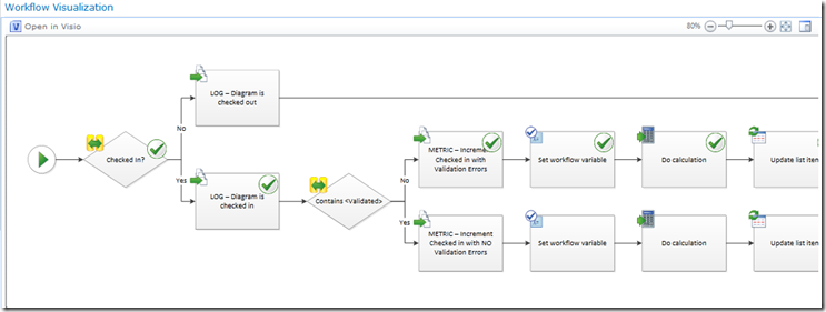
So now you can go from this
To this
WARNING
In the last step I mentioned “appropriate changes”. This is important as you should restrict yourself to formatting changes, layout changes, adding backgrounds, additional shapes that are nothing more than eye candy.
I will tell you that I have had success removing shapes from the diagram that I did not want to include in the visualization. This typically includes shapes like Log to History or Calculation. Low level action shapes that the user most likely does not care about. Removing these shapes turns the visualization you see above into something much simpler.
This is actually a question that I get from a lot of workflow developers, but be aware that any of these changes will affect the round trip so I recommend holding off on any changes like this until the workflow is in its final state and you have tested it’s operation.
If you make a change to the workflow and republish, a new version of the diagram will get generated and will be used for any new workflow instances. You will have to redo your formatting for this new diagram.
I also recommend making a copy of the diagram in the workflow folder before you make any changes so that you can simply rename it to revert back to the VDW that SharePoint Designer generated.


