Visio shape gradients provide a fast way to give your shapes a professional-looking polish, especially for flowcharts and other diagrams that will be seen by a wide audience. You can set the gradient by selecting the shape, right-clicking, choosing Format, and then Fill. Gradients are set by selecting from the Pattern options on the shape's Fill dialog (scroll down the Pattern list towards the end for the gradients). Patterns are listed by number, which I’ve included in the text of my shape examples in this blog. I’m using a blue fill color to better demonstrate the gradient pattern, but typically I would use a lighter color that displayed text better in a real flowchart.
Consider the difference between the following two basic rectangle shapes, one with no fill and the other with the gradient fill of 29.

When you select a gradient pattern, Visio gives you by default a lighter color pattern than your main shape fill color. (Note for some colors you might get a black pattern color; if this is the case, immediately change it to white. It will transfer the gradient completely.) This looks fine, but you can dramatically alter the appearance of the gradient by changing the pattern color (not the shape color) to a lighter shade. The two examples below have the same main color of blue, but use a lighter gray and a white for the pattern color. Notice the effect of the varying types of contrast.

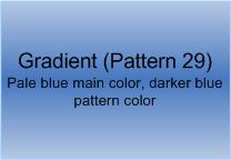
You can also reverse the order of dark shape color and light pattern color for a different look. The shape below uses a pale blue for the main shape color and a medium blue pattern color.

If you want to get a more dramatic look, you can use an even paler (or white) shape color, and a darker pattern color, as the following shapes show. Again, the more vibrant blue is good for demonstration, but I would probably use a lighter shade for a flowchart so that text appears properly.

Stick within the same family of color when pairing up shape fill and pattern colors (with the exception of using white and potentially black if you use white text). Unless you are especially good at color schemes, avoid mixing different colors – especially primary colors. The following shapes demonstrate the gaudiness of mixing blue and yellow.

In my examples, I was using pattern 29 as an example. Here are three other patterns that are also my favorites. I particularly like pattern 40.

Once you get a sense of what the different gradients look like, you can find the color that works best for your diagram. I tend towards using the lighter colors, which make text more visible, like in the shapes below. These examples use a soft green shape color, with a white pattern color.

Gradients are an easy way to upgrade the look of your shape. Once you have the gradient and color pairing of your choice, use the technique described in Applying Shape Formatting to Multiple Shapes blog to spread the effect around your diagram.
-- Mai-lan
This posting is provided "AS IS" with no warranties, and confers no rights
