Visio lets people communicate business information in a variety of innovative ways. One example is in use by the Visio team for revenue reporting. The Visio product management team built a dynamic bubble chart diagram to report on Visio sales by national and international subsidiary to Visio senior management.
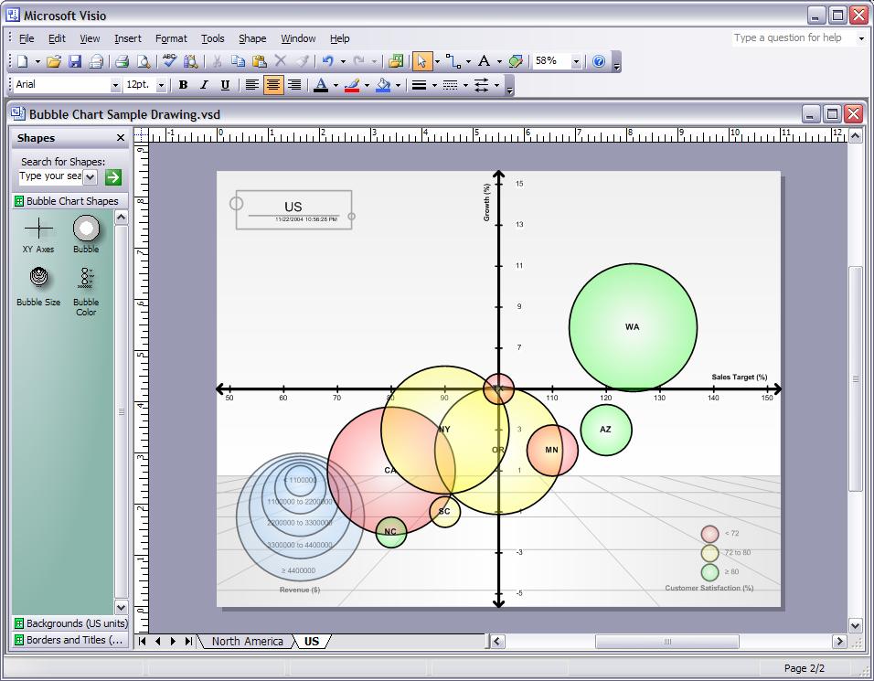
Product management gets the latest sales data by subsidiary in Excel and uses Excel charts to demonstrate trends, like where current revenue falls along annual projections. One of our product managers, Rodrigo, wanted to graphically display how the various subsidiaries performed along an axis of growth % and revenue %. He also wanted to display customer satisfaction % and the $ value of revenue. Doing all this in an Excel chart for multiple subs resulted in a pretty confusing chart. Rodrigo wanted to use a bubble chart, which conveyed all the different dimensions and measures more clearly. Here’s the diagram Rodrigo wanted to create (all data is fictitious).
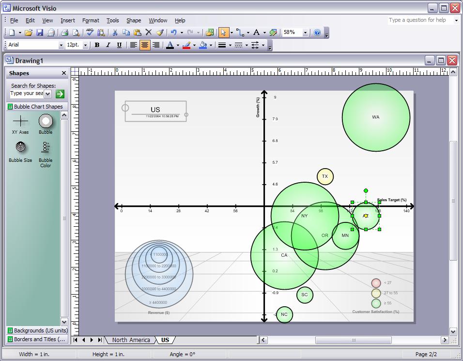
This diagram shows that the WA sub has strong growth and revenue, while the CA sub has negative growth with average revenue. Both WA and CA have the same revenue $ range, as indicated by the size of the bubble itself. The color coding indicates the fourth metric, which is a greater than 55 customer satisfaction %.
Note the stencil on the left contains the custom shapes used by the solution. Really, the bubble size and the bubble color shapes are legend shapes that describe the information on the diagram. The Axis shape helps define the location. The individual bubble shape gets used multiple times as it represents a subsidiary. This bubble chart, which we call the “Vaca Bubble Chart” after the Product Manager who created it, gets rolled out with every business review meeting with Visio senior management.
To generate the bubble chart to use for reports, the product manager goes into Visio and selects a custom diagram type that is installed as part of the Vaca Bubble Chart solution.
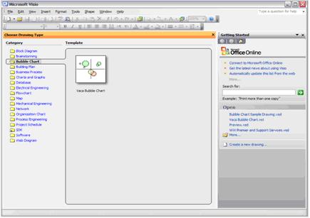
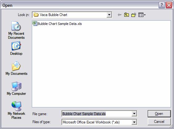
When the user clicks the Vaca Bubble Chart option, the solution asks the user to import data from Excel, and uses the standard Excel dialogs through the Excel API.
In this example, the data looks something like this (the numbers are made up and not reflective of anything):
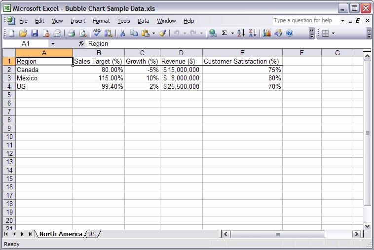
To build the diagram, the solution uses the data to determine the size, text, location, and color of the bubble representing the sub. The values in Region column are used for Shape Text. The values in the Revenue $ column determine the size of the bubble shape itself. Sales Target and Growth percentage columns are used to determine the shapes’ PIN (X,Y) co-ordinates. The bubble’s color depends on the Customer Satisfaction column.
If the data changes, you can re-run the solution to get a diagram like this:
Pretty neat, huh? As I mentioned, our Product Management team uses this report for every revenue reporting meeting with senior management. Chris Castillo, who wrote the solution, is going to talk about the code that drives the diagram creation – I’ll post a link when his blog entry is up.
-- Mai-lan
