To continue our exploration of best practices for shape development we will look at grouping in this post. Grouping is a convenient way of packaging shapes and is the mechanism for creating many complex shapes. Visio offers a number of capabilities for groups, from special interaction behaviors to shape transform changes. It's not surprising to see groups used extensively in master shapes. However, grouping can easily be taken too far, and you can encounter serious performance issues when that happens. Let's look at the issues in detail.
First, a group in Visio is a shape. Prior to Visio 2000 groups were special objects that were not quite the same as shapes. They were containers for shapes but could not have their own text or geometry. Beginning with Visio 2000 groups became full-fledged shapes. Today a group can have geometry and text just like any other shape. A group can be either 1-D or 2-D. It is important to note that groups are shapes too because this is one of the simplest and best optimations to make in shape design. Visio's overall performance is highly dependent on the total number of shapes being managed. A group containing two sub-shapes is three shapes to Visio. If you are using the group merely as a container, you are wasting one shape. Convert one of the sub-shapes into a group and stick the other sub-shape inside. Now you only have two shapes to provide the same functionality.
Second, there is a penalty for using groups in Visio. Every group defines a new coordinate system for the contents of the group. There is overhead required to compute the transforms for these coordinate systems to display shapes on a page. The deeper the nesting of groups the more coordinate transformation that Visio must do. Thus if you must use groups, it is better to keep the structure as flat as possible. We recommend avoiding making any shapes with more than two levels of nested groups.
The most common problem we see in custom shapes (and in some of the ones in the Visio box) is that groups are used where they are convenient, not just where they are required. This results in too many shapes being used in a master. When you are designing your custom master shape, determine the minimum number of shapes required to do the job. An additional shape is necessary when you need another piece of text separate from the shape text you already have or when you need a portion of the shape to have different line or fill formatting than the rest. These are the two conditions: more text or different formatting. You do not need a new shape for more geometry. Visio supports multiple geometry sections per shape. As long as these sections can use the same formatting, this is much more efficient than creating a group.
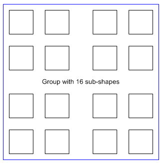
Let's look at an example to see the difference between grouping and geometry sections. Imagine a master consisting of 16 squares. It's easy to create this shape by drawing one square in Visio, then duplicating it 15 times. If you group all 16 squares together, you now have a group with 16 sub-shapes. (A colored box is drawn around the group just for illustration purposes.) Some basic performance testing shows that Visio takes 74 milliseconds to create 50 instances of the master on a page. Each instance requires 64.4 kilobytes of memory.

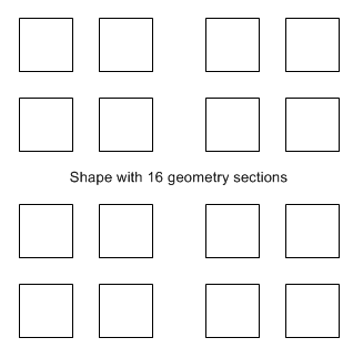
Compare that master to an similar one that uses multiple geometry sections to accomplish the same task. After duplicating the square to make 16 squares total, a Combine shape operation was run to make a single shape with 16 geometry sections. Because there is only one shape, no group is required. Performance testing shows that 50 instances take 31 milliseconds to create, and Visio requires 36.6 kilobytes of memory for each instance. Thus you get better than twice the performance and almost half the memory consumption as the group shape. The differences are more dramatic as you apply local formatting as we saw in a previous post. In this example, there is no reason to use a group because a single shape can accommodate all the necessary geometry. Additional shapes are only required if multiple pieces of text or different sets of formatting are needed.

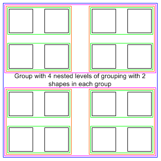
When you do use groups make sure to keep things flat. Additional nested levels add more shapes and more overhead. Pretend that our example master was created by drawing two squares, then grouping them, then duplicating the group, then grouping that, then duplicating and grouping by two until a single group remained. The original 16 squares have become a 31 shape master.

Over the years we have received many customer drawings where performance, memory and file size are severely impacted because of too much grouping. Often it is too late to tell customers to redesign their masters to economize on shape use. Where customers have made changes, the results can be dramatic. Improvements from 2x to 10x are typical. A common excuse heard from shape designers is that they use nested groups because the masters are assemblies of standard components. The shape designers want to keep the components contained within their own groups to facilitate maintainability. Before commiting to this structure we recommend testing the performance of the shapes to know whether the tradeoff in inefficiency is acceptable.
For those that are interested in real-world examples of complex but efficient group shapes, look at the Data Graphics callouts in the new Visio 2007 Professional product. These shapes follow the strict rules for when an additional shape is required, but they have some impressive graphical looks as well.
