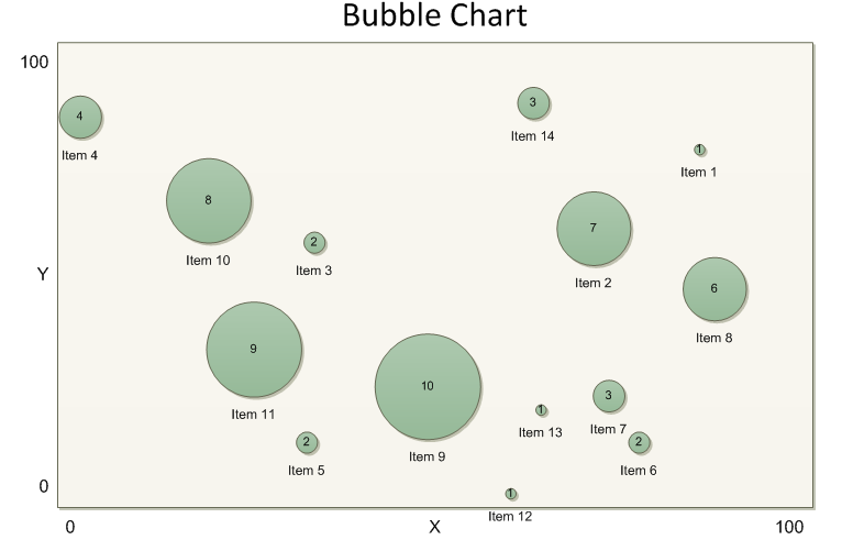
A Bubble Chart is a diagram that presents multi-dimensional data in a graphical form. Each data field is tied to a particular visualization. Most often data controls the Size and Position of elements in the chart. Thus the diagrams often resemble a bunch of bubbles. Taken to an extreme, data can be visualized in almost any way such as Color, Shape, Line Thickness, Shadow or any other formatting. As the data grows more complex, it becomes more important to find effective ways to present it. Bubble charts offer a compact graphical way to present information.

Over the next few posts we will build our very own Bubble Chart stencil. Using the custom Bubble Chart shapes in combination with the Data Link and Data Graphics features of Visio 2007, it is possible to generate Bubble charts from data in just a few steps. In this post we look at the finished solution from a user perspective. The Bubble Chart stencil is included as a file attachment to the post. In subsequent posts, we create the stencil from scratch. Understanding the details of construction will let you customize the solution if you desire.
Using the Bubble Chart stencil
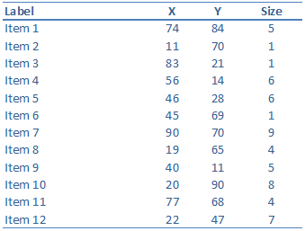
To make a bubble chart, you need the BubbleChart.vss stencil and a data source with data in specially labeled fields. Here is an Excel spreadsheet with the data we will use. Note the column headings: Label, X, Y and Size. Our bubble chart shapes are designed to pull information from fields with these names.

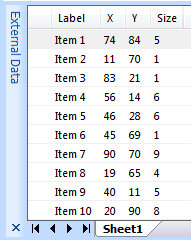
To begin, start a new blank drawing and open the BubbleChart.vss stencil. Go to Data > Link Data to Shapes to import the data from Excel. In the Data Selector wizard, choose Microsoft Excel Workbook. Then browse to the Excel file and click Finish. The data appears in the External Data window.

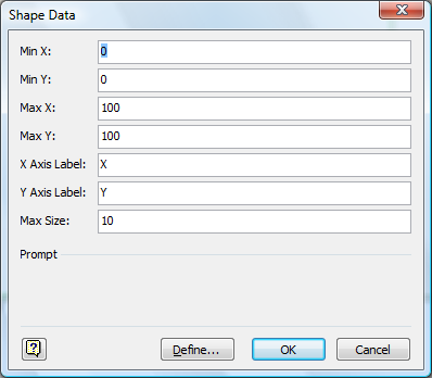
Next drag the Bubble Chart shape onto the page. This shape forms the chart background. It includes labels for the title and axes. The chart shape defines the space where bubble shapes will be placed. As the chart is moved or resized, the bubble shapes will reposition accordingly. Dropping the shape automatically triggers the Shape Data dialog. Fill in the ranges and labels for each axis. The last Shape Data field is Max Size. Enter the largest Size value you expect in your data. Visio will scale the bubbles to make the largest size equal to 1 inch on the page.

Now we are ready to add the bubbles. Select the Bubble Data shape in the Shapes window, but do not drag it onto the page. Instead click on a row in the External Data window and press Ctrl+A to select all the data rows. Then drag the rows onto the page. Data Link drops new Bubble Data shapes and automatically links them to the data. The bubble shapes are placed into the chart according to their data values. The Label and Size fields are displayed as data graphics. The diagram is complete! You can even use the Data Refresh feature to quickly update the diagram when the Excel data changes.
Connect to your data set. Add the Bubble Chart shape. Select the Bubble Data shape and drag out all the data rows. Instant diagram. Next time we'll see how to build the BubbleChart.vss stencil to make it happen.
