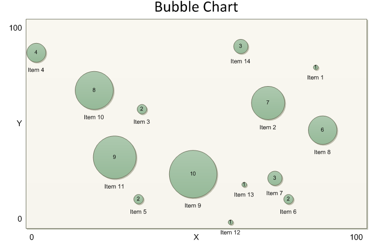
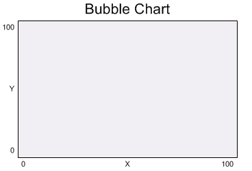
This post is part of a series examining Bubble Chart diagrams. We are building a Bubble Chart stencil from scratch to make diagram creation easy for the user. You can get the completed stencil from the first post in the series. In the previous post, we started working on the Bubble Chart master shape. It captures configuration information from the user when the shape is dropped on the page. The information along with the chart shape's boundaries are stored in properties on the page. Now we will complete the shape by adding the chart labels.

Double-click on the Bubble Chart shape in the stencil to edit it again. There are seven labels on the chart: the title, two axis labels and four axis range boundaries. Visio only allows one text block per shape, so we need seven shapes to display all the text. Our rectangle will hold the text for the title. The remaining shapes will be added as separate text boxes. Select the rectangle and type some default text such as "Bubble Chart". The text is centered horizontally and vertically by default. We want the text to appear above the shape.
Shape text is positioned according to the Text Transform section of the Shapesheet. Go to Window > Show Shapesheet to open the Shapesheet window. Then go to Insert > Section, choose Text Transform and click OK. We need to change the properties associated with the Y coordinate of the text block. To put the text at the top of the chart, set the TxtPinY cell equal to the shape height. To make multi-line text grow away from the shape, set the TxtLocPinY cell to zero (note the way this is represented in the picture). Finally, to keep the text box sized according to its text contents, set the TxtHeight cell equal to the height of the text. Enter the formulas as shown in the picture below.

The default text size can be set in the Shapesheet as well. Find the Character section and set the Size cell to 24 pt.

Next we need to add more shapes for the other labels. The rectangle will be a group shape and the other shapes added as sub-shapes. First, we need to lock the rectangle so that it does not change shapes are added. Find the Protection section and set LockCalcWH to 1. When shapes are added to a group, Visio will recalculate the boundaries of the group to encompass the new shapes. We want our rectangle to define the group boundary and place the labels outside. LockCalcWH prevents Visio from redefining the group boundary. Also lock the rectangle from rotation since our formulas assume no rotation.

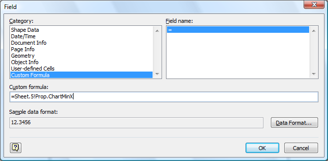
Now we can make the group. Close the Shapesheet window. Then choose Shape > Grouping > Convert to Group. Go to Insert > Text Box and draw a text box on the page. Visio will enter text edit mode and display a flashing caret. Go to Insert > Field and click on the Custom Formula category. Enter a formula referencing the minimum X value of the chart. Sheet.5 is the reference for the rectangle shape. Prop.ChartMinX is the reference for the Shape Data value. Press OK to close the dialog and click away from the shape to exit text edit mode.

Select the rectangle and then Shift+click the text box to select it as well. Go to Shape > Grouping > Add to Group. The order of selection is important. Now the text box is part of the group. Sub-select the text box and go to Window > Show Shapesheet. We need to lock the text box into the correct position around the rectangle. Also the text box should grow to fit its contents. Fill in the Shape Transform section as shown in the picture below. Note the change to the LocPinX and LocPinY to make the text box grow down and to the right.

We need to repeat this process five more times to add the remaining text labels. Here are the remaining field formulas and Shape Transform sections:
ChartMinY
Field formula = Sheet.5!Prop.ChartMinY

ChartMaxX
Field formula = Sheet.5!Prop.ChartMaxX

ChartMaxY
Field formula = Sheet.5!Prop.ChartMaxY

ChartXAxisLabel
Field formula = Sheet.5!Prop.ChartXAxisLabel

ChartYAxisLabel
Field formula = Sheet.5!Prop.ChartYAxisLabel

As a final touch, apply a fill color to the rectangle to make it work with the Theme feature in Visio 2007. Choose a very light color such as 5% Gray or 35% Tint on an Accent Color. The Bubble Chart shape needs to contrast with the Bubble Data shapes we will place on top.

This completes the Bubble Chart shape. We will build the Bubble Data shape in the next post.
