Judging from the page view statistics on the blog, Data Graphics is a topic of interest to a number of people. For those interest in the previous post on building custom data graphics, look here. In this post we’ll look at another way to get more out of the data graphics you create. Our example will focus on the sales data for a fictitious furniture company. Our goal is to use Data Graphics to show financial data about each product.
We have data for the Product Name, Revenue and Expenses associated with a number of furniture products. A first attempt at a data graphic might look like this:
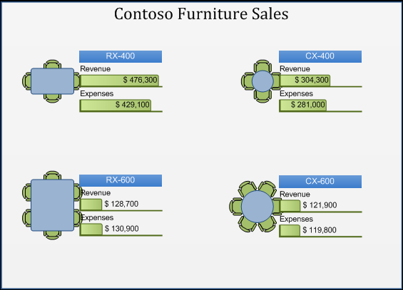
The Product Name is shown as a text callout. Revenue and Expenses are shown using data bars. It would be really helpful to see our profit for each product. That value isn’t part of the data, but we can easily calculate it. Data Graphics supports a wide variety of custom formulas for situations where the data value is not explicitly stored in a Shape Data field. Let’s create a new text callout to show Profit and see how to specify a custom formula.
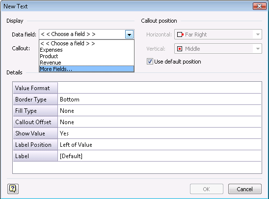
In the Data field dropdown, pick the More Fields option at the end of the list. Then in the Field dialog choose Custom Formula in the Category list. Enter the expression ={Revenue}-{Expenses} in the formula box.
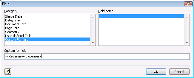
The profit is calculated by subtracting the Expenses from the Revenue. To use other fields in the custom formula, wrap the field names in curly braces. (Technically, the field name corresponds to the Label cell of a Shape Data row for that field.) When Visio applies the data graphic, it figures out what Shape Data fields to use in the custom formula and creates the proper Shapesheet formulas in the callout. You can enter almost any valid Shapesheet expression in the Custom formula box.
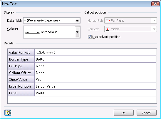
One the field is selected, it is useful to set the value format and label properties of the text callout. The final property values are shown below.
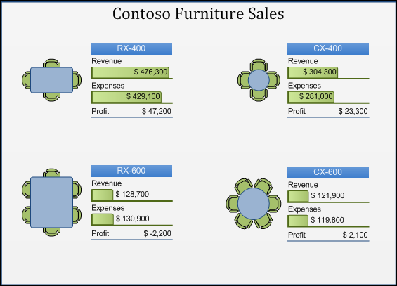
There’s one more thing to make this a great-looking diagram. If you notice in the original image, the data graphic is too close to each shape. Our furniture shapes spill outside their bounding box a bit, making the diagram look cluttered. There is a User-defined cell (User.msvDGCalloutGap) in the Pagesheet that controls the spacing between shapes and data graphics. By making this value larger, we increase the spacing.

Here is the final result with our custom formula and custom spacing:
Please post your comments and questions about Data Graphics in Visio 2007. If you have a suggestion for another blog post on the subject, just let us know.
