The Visio 2010 user interface has been completely revamped this release based on the Office Fluent or “Ribbon” UI. The Office Fluent UI represents a dramatic departure from the overloaded menu and toolbar design model of previous Visio releases. Visio’s extensive capabilities are now organized into logical, easy to find groups that help you accomplish tasks efficiently rather than choosing features.
There are several design elements that comprise the Office Fluent UI.
The Ribbon replaces menus and toolbars as the place to find functionality organized to help you accomplish tasks. You’ll find the many features that Visio 2010 has in common with other Office applications on Ribbon tabs of the same name.
Here’s a brief breakdown of each of the core tabs across the Visio 2010 Ribbon.
The Home tab contains the most common and frequently used drawing tasks and tools: cut/copy/paste from the clipboard, formatting text and shapes, drawing tools, and shape arrangement.
The Insert tab is where you introduce new elements into a drawing: pages, pictures, clip art, CAD drawings, as well as new Container and Callout shapes.
The Design tab includes everything you might change for an entire page: page orientation and size, themes, backgrounds, borders and title blocks, layout commands, and connector styles.
The Data tab provides everything you need for linking external data to drawings and shapes, displaying that data with data graphics, and generating legends to show the meaning of data graphics.
The Process tab includes functionality focused on the creation of business process diagrams: simplified creation of subprocesses, validation of diagrams based upon defined rules, import and export of SharePoint workflows.
The Review tab includes proofing and language tools as well as functionality for inserting and managing comments and other markup when reviewing diagrams.
The View tab is where all drawing and visual aids that assist diagram creation, such as rulers, grid, AutoConnect, and Dynamic Grid are turned on or off.
At the bottom of the application window is the new Status Bar. The right side of the Status Bar includes convenient controls for quickly adjusting the zoom level of the Visio drawing, switching into Full Screen mode, or switching between open drawings.
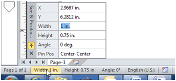
The left side of the Status Bar includes status items related to what you’re working with. Beyond merely showing status, these items help you take actions. For example, if you need to set the width of a shape, simply select it and click on the Width status item. The Size & Position window is opened with the Width value already selected.
In the upper left corner of the application window is the Quick Access Toolbar, into which you can add the commands you use most frequently, eliminating the need to switch to the Ribbon tab on which they are located while creating diagrams.
This post is merely an overview of the primary Office Fluent design elements you’ll see in Visio 2010 Technical Preview. Stay tuned for future posts that will explore the new design in greater detail.
We're interested in your feedback on the new Office Fluent UI design in Visio 2010 Technical Preview, so use the Send a Smile feedback tool or comment on the blog to let us know what you think.


