A challenge many users face when building diagrams is getting them to look neat and organized. Visio has included a number of features to help with the placement of shapes for many releases. Some of these are manual and only help when dragging a single shape. Others are automated but often a bit too rigid in forcing a layout style on shapes with no regard to how the user initially placed them.
What if you could clean up a diagram with a few clicks, maybe just one, and preserve the work you have already put into it? In support of the Ease of Use and Process Management initiatives discussed in our introductory Visio 2010 post, we have added new layout features that make best-effort attempts to clean up a diagram while maintaining the general layout that already exists among the shapes. Rather than tell you how shapes ought to be organized, Visio assumes you have the placement pretty close and simply neatens things up a bit. After all, you know what kind of diagram you’re building and where your shapes belong!
This can be accomplished using Auto Align & Space in the Arrange group on the Home tab.
Auto Align & Space looks at the selected shapes and determines how two shapes that are connected together should be aligned and spaced from one another. It assumes that the shapes are close to the “right” position relative to the rest of the diagram and makes small adjustments to align and space them evenly, giving you a neat and orderly diagram. It acts on the selected shapes or, if no shapes are selected, on the entire page.
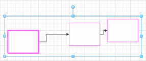
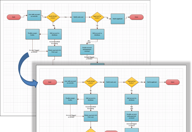
For example, the selected shape below is connected to, close to and almost aligned with the shape on the left. Auto Align & Space examines the connectors and determines that the selected shape is downstream from – or a child of – the shape on the left. The selected shape is moved to align with the left shape and space from it using the default page spacing distance. Everything else connected downstream from the selected shape doesn’t get left behind – it follows along, but does not align or space. Of course, you could also select more shapes to clean up, or have no selection and clean up everything.
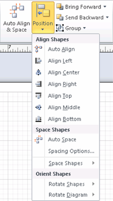
In addition to the big Auto Align & Space button, we have broken out Auto Align and Auto Space as separate actions in the Position dropdown button. One of the big benefits the Ribbon enables is the ability to preview these actions so you can see the effects before committing to the change. We’ll talk more about previewing Ribbon actions in a future post.
Spacing Options lets you choose a non-default spacing distance between shapes for the automatic spacing actions.
We kept the existing Align and Distribute features from previous versions of Visio and enhanced them by enabling preview. The Distribute actions are less frequently used and are located in the Space Shapes flyout menu.
The existing rotate and flip shapes behaviors are in the Rotate Shapes flyout menu.
Rotate Diagram is a new feature that allows you to change the direction a diagram flows by rotating or flipping it, but without rotating or flipping the individual shapes
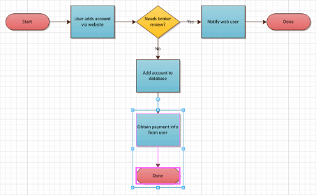
Rotate (and Flip) Diagram is handy when you want part of a diagram to rotate around a parent shape to extend in a different direction, or when you want an entire diagram to be vertical rather than horizontal. For example, selecting the shapes shown below and using Rotate Left makes the diagram more compact.
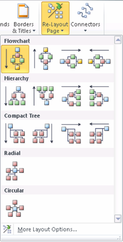
Finally, we have also maintained the existing layout feature from previous versions of Visio. You can find Re-Layout Page in the Layout group on the Design tab. This is useful when you want Visio to completely revise the layout of the diagram. We pulled the most common layout configurations into a gallery so you can preview them to see how different layout choices will affect your diagram. More Layout Options takes you to the traditional dialog with full layout options.
As always, we're interested in your feedback on layout, so use the Send a Smile feedback tool or comment on the blog to let us know what you think.


![clip_image002[6] clip_image002[6]](clip_image002[6]_thumb.png)
![clip_image004[5] clip_image004[5]](clip_image004[5]_thumb.png)
