For several releases Visio has enhanced the appearance of shapes in diagrams by adding isometric projections or themes with gradients and shadows. All the while, their appearance in the Shapes Window has been unchanged. The 32x32 pixel icons have been limited to 16 colors (reminiscent of the EGA color palette from 1984). Thus the Shapes Window icons have not kept pace with the visual updates on the drawing surface.
Visio 2010 remedies that with a feature called Live Rendering. We briefly mentioned this feature in the Shapes Window article, but we’ll go a little deeper here. Live Rendering replaces a shape’s icon with an image of what the shape actually will look like on the page. You can see the full color spectrum used in the gradient fills. You can see the anti-aliasing applied to the geometry and text. If there is currently a theme applied to the page, Visio will even show the shape with the theme applied. What you see is what you get.
Supporting Live Rendering in Your Custom Shapes
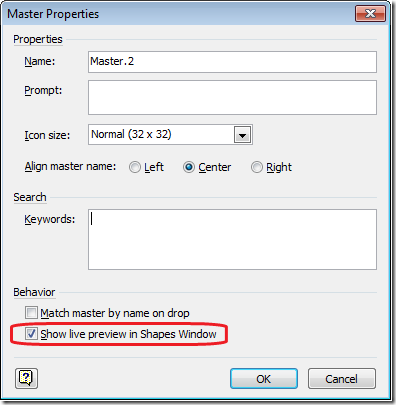
Live Rendering is also available for any of your own custom shapes. Visio 2010 takes the existing setting for automatically generating icons for shapes and repurposes it as a setting for Live Rendering. If you right-click on one of your own shapes in the Shapes Window and choose Edit Master > Master Properties, you can see the revised property.
Of course, Live Rendering may not be the best option for every shape. Perhaps you prefer the icon to be more of an abstraction than a realistic portrayal of the shape. Sometimes the shape has so much detail that it is not understandable in 32x32 pixels. Maybe the shape is oblong and does not scale down to a 1:1 aspect ratio well. In these cases it is best to stick with the shape icon, which is still limited to 16 colors in order to maintain file compatibility with previous releases.
Custom Crop Regions
However, there is a common situation that we felt was important to support with Live Rendering. Sometimes only a portion of a shape is visually distinct from other shapes in the same stencil. After all, shapes that are found in the same stencil are probably related, so they may share some common visual attributes. In these cases the distinction may be too small to be useful when displaying the shapes as icons. To alleviate this problem, Live Rendering supports custom crop regions. Instead of rendering the full extents of a shape and shrinking that to icon size, Visio can render a specific region of a shape and use that for the icon.
Let’s see an example from the shapes in Visio 2010’s SharePoint Workflow content. There are dozens of workflow shapes that correspond to activities you can perform with SharePoint. Each shape consists of a rectangle with a text label and a thumbnail image.
You can see that the thumbnails are the most visually distinctive part of the shapes. What happens when you put these in the Shapes Window and turn on Live Rendering? Unfortunately the details are lost. In prior releases your only option would be to manually draw an icon using the 16 color palette and live with a very poor representation of the shape. With a custom crop region, Visio only displays the relevant portion of the shape.
A custom crop region is specified by adding a User-defined cell to the Pagesheet of the master shape in the Master Edit Window. Add a cell named User.msvPreviewIconCropToPage and set the value to 1. Then modify the size of the page and the position of the shape on the page such that only the portion of the shape you want rendered overlaps the page. You can look at the masters for the SharePoint Workflow shapes or the Callouts for more examples.
Live Rendering shapes in the Shapes Window is an important part of the overall user interface update in Visio 2010. For shape designers, Live Rendering and custom crop regions provide new opportunities for showcasing your rich, graphical content. Please let us know what you think by using the Send a Smile feedback tool or commenting on the blog.


