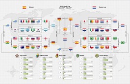
 Congratulations to Spain for winning the 2010 World Cup! Now that the games are over and we’re all suffering through soccer withdrawal, here’s a recap of the world cup summarized as a Visio diagram. You can use this diagram as a reference to remember who eliminated who, and which group your team was in. You can also see some stats like who the top scorers were, and who received the most yellow cards.
And as a bonus, you can view this diagram with Visio Services ! (If you don’t have a SharePoint server handy, you can see what Visio Services looks like).
This diagram highlights one of the many ways you can use Visio to visualize information. We’ve seen people create intricate diagrams for all types of sports, like bracket diagrams for March madness, elaborate baseball diagrams, and classic Xs and Os for drawing up American football playbooks.
As always, let us know if you have any feedback on Visio 2010, Visio Services, or suggestions for blog posts you would like to see.
