I've seen a number of links to a new paper and page showing a summary of different visualization techniques: A Periodic Table of Visualization Methods. Since I often find that the most challenging aspect of visualization for most people is coming up with interesting novel ways to display data, this is a useful tool for inspiration. There is a fair amount of repetition in the table (people have a fondness for renaming similar diagram types) but it is great to see a resource like this.
As you look at all of these diagram types and want to think about how they would be used for your data, it is interesting to think about how they use the available visual vocabulary (derived from the Semiology of Graphics by Jacques Bertin)
- Position
- Color Hue
- Texture
- Connection
- Containment
- Density
- Color Saturation
- Shape
- Length
- Angle
- Slope
- Area
- Volume
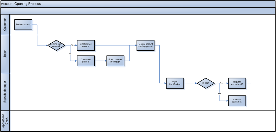
For example, taking a look at a process swimlane diagram (Sw in the Periodic Table) we see Connection, Containment, Position, and Shape used as follows:
- Connection represents the sequence of the steps.
- Containment (in the swimlanes) represents the department performing the process.
- Position on the x axis represents time.
- Shape represents the type of step (rectangle for normal step, diamond for a decision).
- We also use text to represent identify each step.
Of course, we have a fair amount of the vocabulary left over for the rest of the data that might be associated. That is where Data Graphics come in.