This is the second post in a series demonstrating how you can create data graphic callout shapes for use in Visio 2007 Professional. The first post discussed Text Callouts. There is also an article on MSDN that covers the full spectrum of customization possibilities for Data Graphics.

A Data Bar is one of the four ways you can visualize data using Data Graphics. It displays numeric data in a graphical form using the geometry of the callout shape to indicate the magnitude of the data value. Data Bars may also display text and can even display multiple fields at once. As with the other Data Graphics callouts, the visualization is as customized as you want to make it.
In this post we are going to create the “slider” shape shown above. This callout has two parts. A long, thin bar shows the full range of possible data values, and a circle slides along the bar to indicate the current data value. The circle also displays the current data value as text expressed as a percentage. Let’s start with the bar and perform the minimum tasks necessary to create a Data Graphic callout.
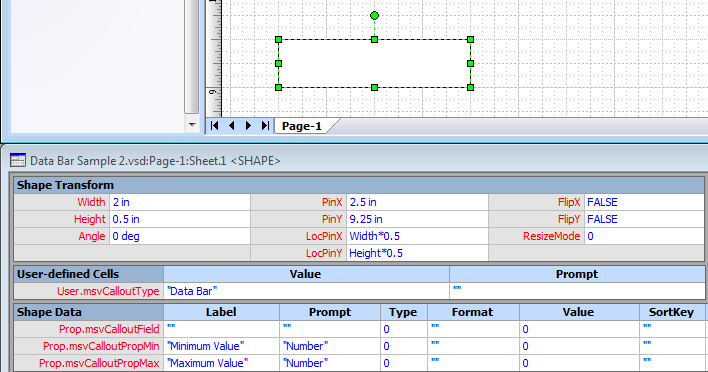
We draw a rectangle on the page and open its Shapesheet. In the Shapesheet, we need to insert a User-defined section and a Shape Data section. To make this shape a Data Graphic callout, first change the row name of the User-defined row to User.msvCalloutType (click on the row name and type "msvCalloutType"). In the Value cell enter "Data Bar" - including the quotation marks here. Next change the row name of the Shape Data row to Prop.msvCalloutField (click on the row name and type "msvCalloutField"). Data Bars also have Shape Data rows for the minimum and maximum values that the callout field can have. Add two more Shape Data rows named Prop.msvCalloutPropMin and Prop.msvCalloutPropMax. Enter labels in the Label column and the word “Number” in the Prompt column as shown in the screenshot.
Visio uses the User.msvCalloutType value to determine where to surface your custom callout shape in the Data Graphics user interface. This shape will appear in the Callouts list in the New Data Bar / Edit Data Bar dialog. Visio populates the Prop.msvCalloutField value (the Value cell in this row) with the data to display at the time the data graphic is applied to a shape on the page. Visio also will fill in values for Min and Max based on the data recordset, and these are exposed in the Data Bar dialog as well. This shape will now be treated as a Data Graphic callout if you drag it into the Document Stencil, but right now it doesn’t do anything with the data from Visio. We need to build out the rest of the shape to make it work like a data bar.
Label display
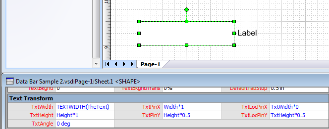
Our rectangle will serve as the long, skinny part of the data bar - indicating the full range of field values. It also is responsible for displaying the field label. We want this label to be optionally hidden as is the case in the sample callout above. Visio will place the field label in the Prop.msvCalloutField.SortKey cell (a strange place, yes, but the Label cell is already used for exposing properties in the Data Bar dialog). Enter some default text such as “Label” (including quotation marks) in this cell. Then select the rectangle in the drawing window and choose Insert > Field. Choose Custom Formula and then enter the formula: “=Prop.msvCalloutField.SortKey” (no quotation marks) and press OK. We want the label to be outside the rectangle on the right side. In the Shapesheet insert a Text Transform section and fill it out as shown below:
We want the user to be able to choose whether the field label is shown or hidden. Data Graphics allows us to create our own callout property to display in the Data Bar dialog. Add a new Shape Data row and name it Prop.msvCalloutPropShowLabel. The row name must include the prefix “msvCalloutProp” to be recognized as a callout property. Then place a human-readable name in the Label column and the word “Bool” in the Prompt column. The Label value appears in the dialog as the name of the property. The Prompt value tells Data Graphics what type of control to use in the dialog – in this case a simple True / False dropdown. Visio will put the user’s choice in the Value cell. Go ahead and enter the default value True here. A full explanation of the syntax for custom callout properties is included in the MSDN article. Finally tie the visibility of the shape’s text to this Value cell by entering this formula in the HideText cell: “=NOT(Prop.msvCalloutPropShowLabel)”.

Data bar value
Next we will create the circle shape that represents the current value for the data bar. The rectangle and circle together form the callout shape, so we need to make a group. Select the rectangle shape and choose Shape > Grouping > Convert to Group to make this the top-level group shape. In the rectangle’s Shapesheet set the LockCalcWH cell to 1 so that further grouping operations do not change the shape’s size. Also set the DisplayMode cell to 1 so that the rectangle will appear behind its subshapes. Now draw a circle on the page. Select the rectangle, then Ctrl-click on the circle to select it as well. Choose Shape > Grouping > Add to Group to make the circle a subshape of the rectangle.
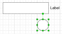
The position of the circle is dependent on the current field value and its relative size versus the Min and Max values. We’ll add a User-defined cell to the rectangle shape to calculate the percentage of the total range. In the rectangle’s Shapesheet add a User-defined row named User.PercentFilled and enter this formula:
=BOUND((Prop.msvCalloutField-Prop.msvCalloutPropMin)/IF((Prop.msvCalloutPropMax-Prop.msvCalloutPropMin)<>0,Prop.msvCalloutPropMax-Prop.msvCalloutPropMin,1),0,FALSE,0,1)
This expression calculates the current percentage of the field value between Min and Max. It also prevents division by zero and checks to make sure that the result stays between 0 and 1 so that our data bar behaves predictably.

Value display
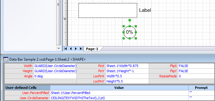
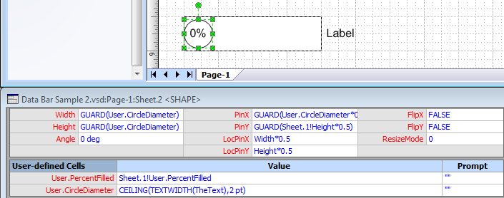
The User.PercentFilled value will be used by the circle subshape to control its position and to display the value as text. We’ll start with the value display. In the circle’s Shapesheet insert a User-defined section and add a User.PercentFilled row that references the value from the rectangle. Since we will use this value multiple times, it is good practice to use a single cross-sheet reference and then multiple local cell references. (Note that your sheet ID’s may be different than those shown here.)

Now select the circle in the drawing window and choose Insert > Field. Choose User-defined Cells and select the PercentFilled cell. Before closing the dialog click on the Data Format button. Choose Percentage and 0 decimal places. Then click OK twice. Next we want to tie the size of the circle to the size of the text so that the text always fits. Add another User-defined row named User.CircleDiameter to track the size of the circle. Then add this expression for the value: “=CEILING(TEXTWIDTH(TheText),2 pt)” (omit quotation marks). This expression calculates the current width of the text and rounds it up to the nearest 2 pt to get rid of tiny variations in text width based on proportional character spacing. We add formulas to the Width and Height cells of the circle to tie its size to User.CircleDiameter. The formulas are GUARDed to prevent accidental resizes by the user. Set the NoObjHandles cell to 1 to hide the resize handles since they are not needed.
Value position
We’re ready to tie the position of the circle to User.PercentFilled. The circle should move from one end of the rectangle to the other. We must account for the circle diameter when calculating the range of movement so that the circle does not move overlap the ends of the rectangle. Add this formula to the PinX cell:
=GUARD(User.CircleDiameter*0.5+User.PercentFilled*(Sheet.5!Width-User.CircleDiameter))
Also set the PinY cell: “GUARD(Sheet.1!Height*0.5)”.
Finishing touches
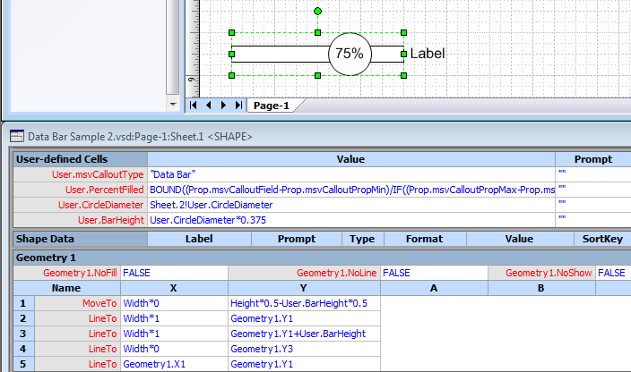
Our callout is now functional enough to test. Open the rectangle’s Shapesheet and enter sample values for Prop.msvCalloutField as well as the Min and Max properties. You should see the circle move and display the proper value as text. The only remaining work is to enhance the appearance of the data bar. The rectangle height should be a fraction of the circle diameter. Actually, the height of the rectangle shape should encompass both the rectangle and the circle, so we’ll just make the geometry of the rectangle shape smaller. Add a User-defined row named User.CircleDiameter to the rectangle and reference the circle’s User.CircleDiameter cell. Then add a User-defined row named User.BarHeight and set it to be a fraction of the circle size. The geometry of the rectangle is then modified to depend on User.BarHeight as shown in the screenshot below.
The overall size of the callout should be fixed; the width is set to a constant value and the height is large enough to hold the circle. Enter the formulas for Width and Height as shown in the image below. Note that DropOnPageScale is a factor that adjusts the size in cases where a scale other than 1:1 is used in the drawing. This is a good practice whenever hard-coding measurement values like the ones in these formulas.

One final change is to set the LockFromGroupFormat cell to 1. This prevents formatting changes applied to the main shape from propagating to the callout. Generally we want the callout to retain its own formatting unless the user directly selects the shape and modifies it. Our callout shape is complete. The rest of the look is achieved through Themes. Apply a color theme and effects theme to the page. Our sample uses the “Office” color theme and “Button” effects theme, but the callout will pick up whatever theme is applied in your document. Sub-select the circle shape and change the fill color to make it stand out from the rectangle. Accent 2 is a good choice here. The finished shape is below.

Testing the callout
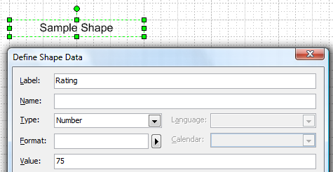
To use this callout, we need to make it a master shape in the Document Stencil. Go to File > Shapes > Show Document Stencil and then drag the shape in. Rename the master to “Slider”. Now we need to apply it to a shape. Draw a text box on the page and type some text. Then right-click on the shape and choose Data > Shape Data. Answer Yes to define new shape data. Add a Label, set the Type to Number and enter a sample Value before clicking OK. Click OK once more to finish adding data to the text shape.
Right-click the shape again and choose Data > Edit Data Graphic. Choose New Item > Data Bar to open the N
