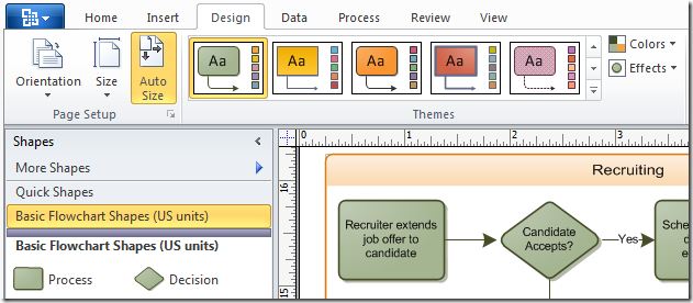
In Visio 2007, we introduced the Themes feature to make it easy to apply a professionally designed look to a diagram. In Visio 2010, the Themes feature gets a whole new user interface that takes advantage of the Office Fluent UI. The theme choices are displayed in a gallery on the Design tab in the ribbon.
An improvement over Visio 2007 is that you can apply both theme colors and effects with one click on a thumbnail in the main Themes gallery, instead of having to visit two separate task panes. Each thumbnail is a pairing of a color scheme from the Colors gallery and an effect scheme from the Effects gallery.
As in Visio 2007, the color schemes include colors for text, fills, lines, connectors, shadows, and backgrounds, as well as a collection of five accent colors. The effect schemes include the font used in text, as well as formatting for the fills, lines, connectors, and shadows.
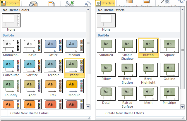
If none of the theme pairs in the main gallery are to your liking, you can choose from any of the schemes in the Colors or Effects galleries, which are located next to the main gallery.
As in Visio 2007, you can also click “Create New Theme Colors” or “Create New Theme Effects” at the bottom of the gallery to create your own custom theme.
Live Preview
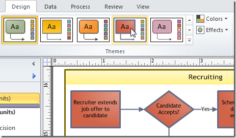
Themes is one of the features that demonstrate the Live Preview capability of the Office Fluent UI. As you move the cursor over each thumbnail in the gallery, the theme’s formatting is previewed on your diagram. This lets you quickly experiment with various looks without forcing you to commit to the change. If you don’t click on anything, the diagram reverts back to whatever was applied before the preview.
Live Preview helps break the repetitive “Undo” cycle of applying formatting to content, deciding against the formatting change, choosing Undo to return to the original formatting, and then starting the cycle all over again.
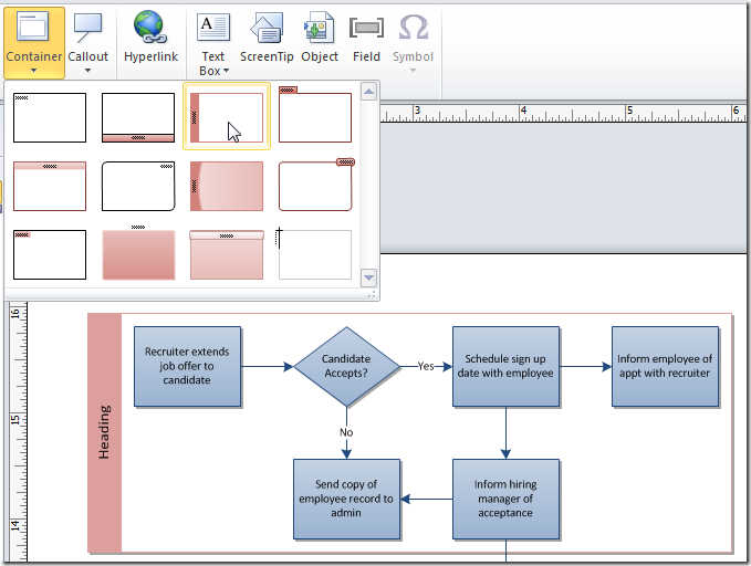
Live Preview is available for many other galleries and menus in Visio 2010. Another feature that makes good use of it is the Containers feature discussed in an earlier post. When you move the cursor over the various container designs in the Container gallery on the Insert tab, the container style is previewed on the selected shapes so you can see what it would look like if applied.
If you’re running the Visio 2010 Technical Preview, check out the new Themes user interface and Live Preview and let us know what you think via Send a Smile or a comment on the blog.


