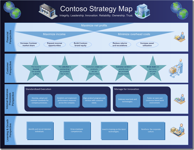
The new Containers feature in Visio 2010 is great for adding structure and organization to Visio diagrams. In this post, we’ll walk through the creation of one diagram, the strategy map, which is easy to make using containers.
The strategy map
A strategy map is a way for companies to document their primary strategic objectives. It visually shows the goals being pursued by an organization and the relationships between these goals. Commonly, a strategy map is part of the documentation associated with the Balanced Scorecard, a framework used to help design and implement strategic performance management tools.
A strategy map typically consists of three components:
- Objectives, representing the goals that the organization is pursuing,
- Perspectives, representing broad categories for classifying the objectives, and
- Arrows, representing causal relationships between objectives.
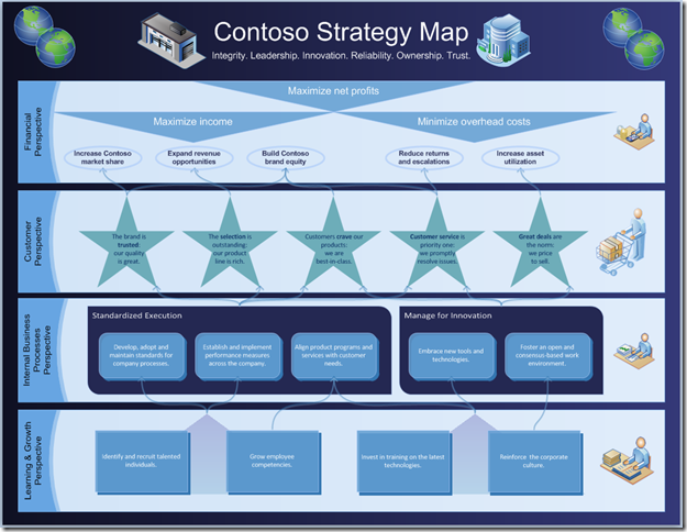
It’s easy to build a great-looking strategy map in Visio 2010. Here’s a walkthrough of how we built the strategy map below.
Getting started
Since the shapes in a strategy map are simple geometric shapes, we started with the Basic Diagram template located under the General template category on the New tab of the Microsoft Office Backstage View.
Once we had a blank diagram, we did some simple steps to get the page ready for the strategy map:
- On the Design tab, we changed the Orientation to Landscape.
- On the View tab, we unchecked the Grid checkbox.
This gave us a blank page with the correct orientation and grid lines turned off.
Adding perspectives
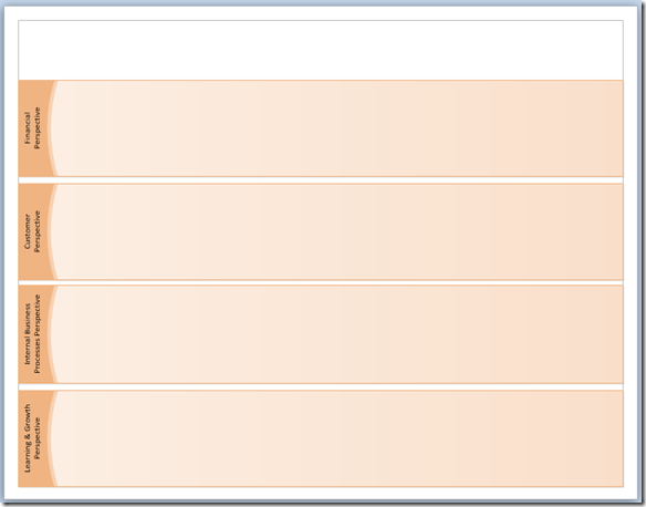
In a strategy map, objectives are organized into different perspectives. Traditionally, these perspectives focus on the areas of finance, marketing, process and organizational development. Using this convention, we started by creating "Financial", "Customer", "Internal Business Processes", "Learning & Growth” perspectives. These are best represented in Visio using containers.
To get our first container on the page and formatted, we performed the following steps:
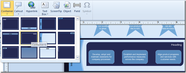
- On the Insert tab, we picked a container from the Container drop down menu.
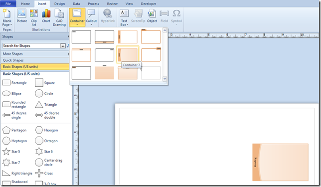
- We selected the newly inserted container and resized it to the desired dimensions.
- On the Container Tools contextual tab, visible only when a container is selected, we used the Automatic Resize drop down menu to select No Automatic Resize.
Tip: Turing off Automatic Resize is good for situations where you have many containers on the page that must be the same size. This prevents the containers from expanding to fit new shapes.
- We copied the container three more times, then positioned and labeled the containers.
The foundation for the strategy map was now complete.
Adding objectives
Objectives are the goals that the company identifies as areas of focus. Typically, each objective is represented by text appearing within a shape.
For our diagram, we picked a different shape to represent the objectives in each perspective. We picked the Ellipse shape for financial objectives, the Star 5 shape for customer objectives, the Rounded rectangle shape for internal business processes objectives, and the Rectangle for learning and growth objectives.
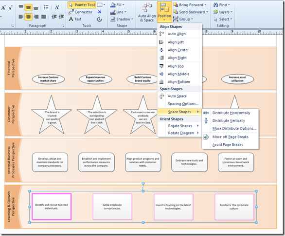
As we added shapes to the diagram, the dynamic grid made it easy to ensure that shapes were dropped on the page evenly space and centered.
Tip: You can also use the Position functionality on the Home tab to ensure that shapes are perfectly aligned.
At the top of the first perspective, we wanted to add some overarching goals for the company. We thought that these objectives would look best as upside-down triangles. We added a Triangle shape to the page, resized it and used the knob at the point of the triangle to rotate the shape.
Then, we added text.
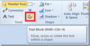
Notice that the text was still upside down. On the Home tab, there is a Text Block tool for rotating text. With the tool turned on, a knob appears for rotating text. We used this tool to rotate the text. Once the text is rotated, remember to go back to Pointer Tool mode by selecting the Pointer Tool in the same ribbon chunk.
When we had one upside-down triangle, we used copy and paste to create two additional triangles.
Adding a background, theme and title
Using the Text Box tool on the Insert tab, we added a title and subtitle for the diagram.
Then, we wanted to add some color and formatting to the diagram. The first two things that came to mind were a background and a theme. We added these using the following steps.
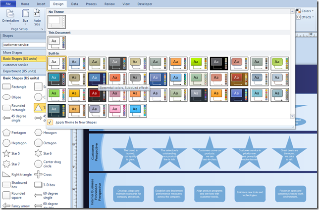
- On the Design tab, we selected the Backgrounds drop down and picked the Horizontal Gradient background.
- Also on the Design tab, we selected a theme for the diagram.
The diagram above shows themes being live previewed. As the cursor moves over each thumbnail in the gallery, the theme’s formatting is previewed on the diagram. This lets you quickly experiment with various looks without forcing you to commit to the change.
Adding graphics
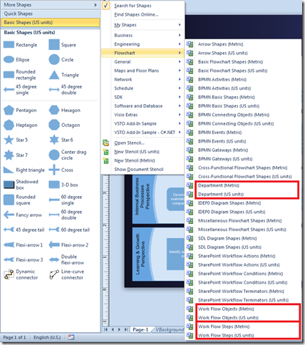
The Department, Work Flow Objects, Work Flow Steps, and Landmark Shapes stencils have a number of useful people, building and work-related shapes that will help add character to a diagram. You can open the Department stencil by clicking on More Shapes fly out in the area above where the shapes are displayed, then clicking Flowchart, and then clicking the Department stencil. The Work Flow Objects and Work Flow Steps stencils are also under the same Flowchart menu.
We used a number of different shapes from the Department stencil, including the International division, Headquarters, Finance, and Operations shapes. We also used the Customer shape from the Work Flow Objects stencil and the Research shape from the Work Flow Steps stencil.
To find different building types, we opened the Landmark Shapes stencil by clicking on More Shapes fly out, then clicking Maps and Floor Plans, then Map, and then the Landmark Shapes stencil. We used the Warehouse shape from this stencil.
More shape customizations
At this point, the diagram was mostly built, but the diagram still needed a bit more personality.
We wanted to show that there are two main types of the objectives inside the internal business processes perspective. The first three objectives are related to “Standardized Execution”, while the last two objectives are related to “Manage for Innovation”. This was another occasion suited for containers.
We selected the shapes to go in the container and inserted a container using the Container drop down on the Insert tab. The container was inserted around the selected shapes. Even though the shapes were already on the page, it was no trouble to get them grouped in a container.
We were quickly able to add a second container and then label them both. On the Home tab, we used the Align Left button in the Paragraph chunk to move the title text to the left of the container. Notice that the shape changed slightly to adapt to the new text position.
Tip: After a container is inserted on the page, it is still easy to change its look. On the Container Tools contextual tab, visible only when a container is selected, you can select a new style for the selected containers.
To add some additional polish, we updated the fill, line and shadow properties on the shapes. We also changed the font, and added bold to some of the text in objectives. All these options can be accessed in the Home tab. Finally, we repositioned some the shapes so that the graphics did not overlap with the objectives.
Tip: If you have formatted one shape and want other shapes to have the same formatting, you can use the Format Painter. Select the shape with the desired format, click the Format Painter button on the Home tab, and then click the shape that needs formatting. Voila! Both shapes have the same formatting.
Adding connectors
The last step was adding connectors to the diagram to show causal relationships between objectives. We used the Connector tool on the Home tab to add the connectors. In some cases, we took advantage of the connection points on the containers, instead of connecting directly to objectives.
To make the connectors look stylized, we went to the Design tab, clicked on the Connectors drop down, and then clicked Curved Lines.
Since no shapes were selected, this action updated all the connectors in the diagram to curved connectors. Note that we could have also decided to apply the style to a specific set of connectors by selecting these connectors before applying the style.
We then increased the line weight, added a shadow to the line, and changed the color slightly to make the connectors slightly easier to see. We could have made them even bolder and brighter, but decided not to make them the main focus of the diagram.
To reduce the number of connectors in the diagram, we also added two Triangle shapes to the bottom perspective to show that multiple objectives in this area had the same causal relationships.
The final diagram
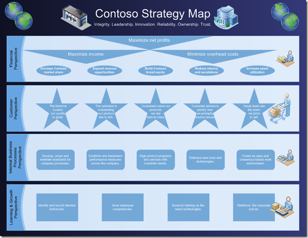
Before long, we had the strategy map shown below.
This strategy map shows business objectives, their associated perspectives and the causal relationships between them. It was easy to create in Visio 2010 using basic geometry shapes, graphical shapes for emphasis, containers and connectors. If you want to download this strategy map, it is available here.
If you have any questions or feedback about this post, feel free to comment on the blog and let us know.

