Visio has long been regarded by interaction designers and information architects as an essential tool in their work. Many software wireframes (aka software mockups) are built using Visio, and they can range from mobile software, interactive web sites, to enterprise application software.
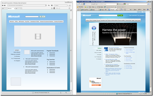
In the past, Visio included a set of Windows XP stencils for such work. For Visio 2010, we decided to refresh those stencils by providing a brand new set of Wireframe shapes that are generic and not specific to the operating system. The intent is to offer the UX community with medium-fidelity UI shapes and icons that can be used to create wireframes for general software design for a wide variety of platforms (e.g. mobile, internet, windows). As an example, see the following mockup of Microsoft Internet Explorer and the homepage of Microsoft.com using the new Wireframe shapes (mockup is on the left, and the actual software is on the right):
This new set of shapes not only allows easier creation of wireframes, but offer many customization options to meet specific design needs. Let’s further examine what Wireframe shapes are included in Visio 2010 and what functionalities are added to make building wireframes easier.
UI Dialogs, Controls, Toolbars and Icons
First, to create a Wireframe Diagram, go to New > Software and Database > Wireframe Diagram:
Similar to previous Windows XP UI shapes, Visio 2010 offer UI shapes for building dialogs, controls, and toolbars. What’s new however is the addition of common UI icons for Windows, web, and multimedia applications. Here is the full set of Wireframe shapes that is included:
Resizable and Configurable
Customizing wireframe UI components are easier than ever. Most Wireframe shapes are resizable and offer options to customize the visuals. For example, a button is a common control and has configurable state options through the right-mouse action menu:
Working with Themes and Formatting
Unlike previous Windows XP UI shapes, the new Wireframe shapes also allow users to customize the look of the UI elements through Themes or formatting. With Themes, users can easily customize color and effects schemes that can be applied to all UI components easily. Moreover, individual controls can be formatted to indicate highlight or indicate different UI states. As an example, the diagram below shows what the wireframes looks as default (no Themes applied), and with Themes applied:
Controls as Containers and Lists
With the introduction of Containers (see earlier blog post for more details), Wireframe shapes such as Dialog form, Application form, and Panel are built as Containers to “contain” any control that is placed inside it. By being a Container, when you move a Dialog form, all controls contained inside it will also move with it.
Also, Wireframe controls such as Tree Control, Drop-down Menus, List Box are shapes to utilize the new list feature, similar to Cross-functional Flowcharts and Data Graphic Legends. Lists allow users to easily add new element to be contained in a List shape through a blue arrow, as demonstrated below in a Drop-down Menu control:
As a result, users no longer need to add shapes through multiple drag-drop or copy-paste operations. Instead, the blue arrow allows for a super quick way to add a lot of UI components while properly aligning and arranging the items at the same time.
Feedback Welcome
We are excited to bring users a brand new set of Wireframe shapes that offer greater versatility and broader application. Please use the Send a Smile feedback tool or comment on this post if you have feedback on the Wireframe shapes.


![clip_image004[6] clip_image004[6]](clip_image004[6]_thumb.jpg)
![clip_image006[6] clip_image006[6]](clip_image006[6]_thumb.jpg)
![clip_image007[6] clip_image007[6]](clip_image007[6]_thumb.png)
![clip_image009[6] clip_image009[6]](clip_image009[6]_thumb.jpg)
![clip_image010[6] clip_image010[6]](clip_image010[6]_thumb.png)