One of the goals of the Visio 2010 release is to make it easier to create attractive, presentation-quality diagrams. Previously on this blog, we have discussed our improvements to backgrounds, layout, routing, and themes. Visio 2010 also features improvements to the default look of many templates, as well as over 500 newly designed shapes. Below are a few highlights of these changes.
New default theme
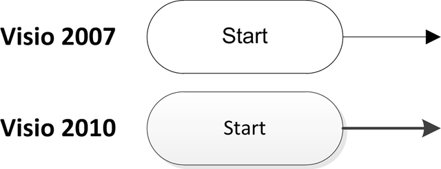
Many Visio 2010 templates feature a new, consistent set of default line, font, and shadow properties that help make diagrams look more modern. Here is an example comparing part of a Visio 2007 flowchart with a Visio 2010 flowchart:
In addition to these general enhancements, below are some specific templates we made significant changes to.
Directional Map
The Landmark Shapes stencil in the Directional Map template has around 30 newly designed shapes. Here are a few:
Workflow
The Workflow Shapes template also has around 30 newly designed shapes. Here are a few:
Calendar
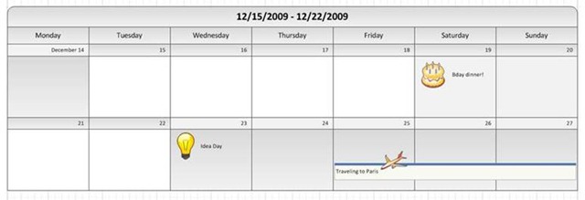
Here is a calendar created in Visio 2010, with our newly designed calendar and icon shapes:
Timeline
Visio 2010’s timeline shapes have a sleek new look. Here is an example:
The above are just a few examples. Here is a more comprehensive list of stencils and templates with new or updated shapes:
- Six Sigma
- Data Graphics Legend
- Containers
- Callouts
- Business Process Modeling Notation (BPMN)
- BPMN Pools & Lanes
- Basic Flowchart
- Compliance
- Cross-functional
- SharePoint Workflow
- Wireframe
- Backgrounds
- Borders
- Timeline
- Web site map
- Calendar
- Workflow
- Landmarks
We are interested in your feedback on these visual updates. You can use the Send a Smile feedback tool or comment on the blog to let us know what you think.


